
A beautiful website means nothing if it doesn’t convert visitors into customers. The difference between a website that looks good and one that drives real business results lies in the application of proven user experience principles. Every element, every pixel, and every interaction should guide visitors toward taking meaningful action—whether that’s making a purchase, signing up for a newsletter, or requesting a consultation. Let’s explore the essential UX principles that transform ordinary layouts into conversion-generating machines.
Understanding the Psychology of Conversion
Before diving into specific design elements, it’s crucial to understand what drives user behavior online. Conversion-focused design recognizes that users arrive at your website with specific goals, limited attention spans, and ingrained browsing patterns. They’re constantly making split-second decisions about whether to stay or leave, scroll or bounce, engage or ignore.
The average user forms an opinion about your website in just 50 milliseconds. Within those first moments, they’re subconsciously evaluating credibility, relevance, and ease of use. If your layout creates friction, confusion, or fails to quickly communicate value, visitors leave—often never to return. Effective UX design removes obstacles, reduces cognitive load, and creates a seamless path from landing to conversion.
Visual Hierarchy: Guiding the Eye Where It Matters
Visual hierarchy determines the order in which users process information on your page. Properly implemented hierarchy ensures visitors see your most important elements first, naturally flowing through your content in the sequence that leads to conversion. This isn’t accidental—it’s the result of deliberate design choices involving size, color, contrast, spacing, and positioning.
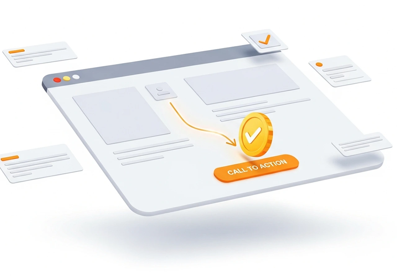
Your primary call-to-action should dominate the visual landscape. Make it larger, bolder, and more colorful than surrounding elements. Use contrasting colors that stand out against your background while maintaining brand consistency. Position primary CTAs above the fold on landing pages, and repeat them strategically as users scroll through longer content. The “F-pattern” and “Z-pattern” reading behaviors inform where users naturally look first—leverage these patterns by placing crucial information along these visual paths.
Typography plays an underestimated role in visual hierarchy. Headlines should be substantially larger than body text, creating clear distinction between sections. Use font weight, size, and color to establish importance levels. A well-structured heading hierarchy (H1, H2, H3) not only improves SEO but guides users through your content logically, making information easier to scan and digest.
Whitespace, or negative space, amplifies hierarchy by giving important elements room to breathe. Cramped layouts overwhelm users and dilute the impact of key messages. Strategic whitespace draws attention to what matters, creates separation between distinct sections, and makes your overall design feel more sophisticated and trustworthy. Don’t fear empty space—embrace it as a powerful design tool that improves comprehension and conversion.
The Power of Strategic Simplicity
Hick’s Law states that the time required to make a decision increases with the number of choices available. Applied to web design, this means cluttered layouts with too many options paradoxically decrease conversions. Simplicity doesn’t mean boring—it means intentional, focused design that eliminates distractions and competing priorities.
Single-column layouts typically outperform multi-column designs for conversion-focused pages. They create a clear, linear path through your content, reducing decision paralysis and keeping users focused on your primary conversion goal. Save multi-column layouts for content-heavy pages where users need to browse multiple options, like blog archives or product catalogs.
Limit navigation options on high-intent pages. Landing pages designed for specific campaigns often perform better with minimal or no navigation menus. While this seems counterintuitive, removing navigation prevents visitors from clicking away before converting. For standard website pages, streamline navigation to 5-7 main items, using dropdown menus sparingly and only when truly necessary.
The “one page, one goal” principle focuses each page on a single primary action. Home pages might aim to move visitors deeper into the site, product pages seek purchases, and contact pages encourage form submissions. When every element supports this singular goal, conversion rates improve dramatically. Audit your pages and ask: what’s the one action I want visitors to take here? Then ruthlessly eliminate or de-emphasize everything that doesn’t support that objective.
Creating Friction-Free User Journeys
User friction encompasses anything that slows down, confuses, or frustrates visitors as they move toward conversion. Identifying and eliminating friction points dramatically improves conversion rates. Common friction sources include confusing navigation, slow load times, unclear value propositions, complicated forms, and unexpected costs or requirements.
Forms represent major conversion bottlenecks. Every field you require represents a decision point where users might abandon the process. Minimize form fields to only what’s absolutely necessary for that stage of the relationship. You can always collect additional information later. Use smart defaults, autocomplete functionality, and clear field labels positioned above input boxes rather than inside them. Show progress indicators on multi-step forms, so users know how much effort remains.
Loading speed critically impacts both user experience and conversion rates. Studies consistently show that even one-second delays in page load time result in measurable drops in conversions. Optimize images, minimize HTTP requests, leverage browser caching, and use content delivery networks to ensure your pages load quickly. Google’s PageSpeed Insights provides specific recommendations for improving load times.
Mobile optimization isn’t optional—it’s essential. With mobile traffic exceeding desktop for most websites, responsive design that adapts seamlessly to smaller screens determines success. Touch targets must be large enough for finger taps (minimum 44×44 pixels), text must be readable without zooming, and navigation must work intuitively on touchscreens. Test your site extensively on actual mobile devices, not just desktop simulators.
Trust Signals and Social Proof
Visitors are inherently skeptical, especially when asked to provide personal information or payment details. Building trust through design elements significantly improves conversion rates. Trust signals come in many forms, each addressing different concerns users might have about your legitimacy and reliability.
Social proof leverages the psychological principle that people look to others’ behavior when making decisions. Customer testimonials, review ratings, case studies, and client logos all demonstrate that others have trusted you successfully. Display these elements prominently near conversion points. Specific testimonials that describe real problems you solved carry more weight than generic praise. Include photos and full names when possible to enhance authenticity.
Security indicators reassure users about data safety. Display trust badges from recognized security providers, SSL certificates, and payment processor logos near checkout areas. Clearly communicate your privacy policy and how you protect customer data. For e-commerce sites, prominent display of secure payment icons significantly reduces cart abandonment.
Professional design quality itself serves as a trust signal. Outdated designs, broken layouts, grammatical errors, and low-quality images all erode confidence in your brand. Users subconsciously equate design quality with business legitimacy. Investing in professional design pays dividends through improved credibility and conversion rates.
The Strategic Use of Color and Contrast
Color psychology influences user behavior more than most realize. Different colors evoke distinct emotional responses and affect how users perceive your brand and offerings. Warm colors like red and orange create urgency and excitement, making them popular for sales and call-to-action buttons. Cool colors like blue and green convey trust and stability, explaining their prevalence in financial and healthcare websites.
Contrast directs attention and improves usability. Your primary CTA button should contrast sharply with surrounding elements to draw the eye immediately. However, contrast serves purposes beyond aesthetics—it’s essential for accessibility. Ensure sufficient contrast ratios between text and backgrounds so all users, including those with visual impairments, can read your content easily. Tools like WebAIM’s contrast checker help verify you meet WCAG accessibility standards.
Color consistency across your site creates cohesion and reinforces brand recognition. Establish a limited color palette—typically a primary brand color, 2-3 secondary colors, and neutral backgrounds—and use them consistently. This restraint makes your design feel more professional and helps important elements stand out when you do use accent colors.
Directional Cues and Visual Flow
Humans naturally follow visual cues that suggest direction or movement. Savvy designers use these cues to guide users toward conversion points. Arrows, lines, and implied movement created through design elements direct attention where you want it. Images of people looking or pointing toward key content leverage our instinct to follow gaze direction.
The “line of sight” principle positions important elements along natural eye movement paths. Place CTAs where users’ eyes naturally land after reading a headline or viewing an image. F-pattern layouts position key information along the top and left side where users look first. Z-pattern designs guide eyes from top left to top right, then diagonally down to bottom left and across to bottom right—ideal for landing pages with clear conversion goals.
Scrolling behavior has evolved with modern web design. Users are now comfortable scrolling, but you must still provide compelling reasons to continue. Use progressive disclosure to reveal information gradually as users scroll, creating a narrative that builds toward conversion. Implement scroll-triggered animations sparingly to maintain interest without becoming distracting. Place secondary CTAs at natural scroll stopping points throughout longer pages.
Responsive and Adaptive Layouts
True responsive design adapts not just visually but functionally to different devices and contexts. Navigation that works beautifully on desktop might frustrate mobile users. Consider how users interact differently with various devices—mobile users are often on-the-go seeking quick information, while desktop users might be researching more thoroughly.
Breakpoints should be determined by content, not just popular device sizes. Test your layouts at various widths and establish breakpoints where your design begins to break down. This ensures optimal experiences across the full spectrum of screen sizes, not just the most common ones. Flexible grids, scalable images, and CSS media queries form the technical foundation, but the design decisions about what to prioritize at each size determine conversion success.
Consider connectivity and data constraints, especially for mobile users. Implement progressive enhancement, starting with a functional experience for all users and enhancing it for those with better devices or connections. Use responsive images that serve appropriately sized files for different screens. Lazy loading defers loading images until users scroll to them, improving initial page load times dramatically.
Accessibility as Conversion Optimization
Accessible design isn’t just ethically important—it expands your potential customer base and often improves conversion rates for all users. Accessibility principles create clearer, more usable interfaces that benefit everyone, not just users with disabilities. Semantic HTML, proper heading structure, and descriptive link text improve both accessibility and SEO.
Keyboard navigation ensures users who cannot use mice can still navigate your site effectively. All interactive elements should be accessible via keyboard, with visible focus indicators showing where keyboard focus currently rests. This seemingly technical requirement often reveals navigation and interaction patterns that could be improved for all users.
Alternative text for images, transcripts for videos, and captions for audio content make your content accessible to users with visual or hearing impairments while providing additional context search engines can index. Consider these accessibility features as opportunities to reinforce your message through multiple channels rather than mere compliance requirements.
Testing and Iterating Toward Better Conversions
Even the most experienced designers cannot predict with certainty which layout will convert best. Data-driven design through systematic testing removes guesswork and continuously improves performance. A/B testing compares two versions of a page to determine which achieves better conversion rates. Test one element at a time—headlines, CTA button color, form length, or layout structure—to understand what specifically impacts results.
Heat mapping and session recording tools reveal how users actually interact with your layouts. Where do they click? How far do they scroll? Where do they abandon? This qualitative data complements quantitative analytics, helping you understand not just what users do, but why. Tools like Hotjar, Crazy Egg, or Microsoft Clarity provide these insights affordably.
User testing with real people uncovers issues you’ll never spot yourself. Watch actual users attempt to complete tasks on your site while thinking aloud about their experience. Their confusion, hesitations, and comments reveal friction points and opportunities for improvement that data alone misses. Even informal testing with 5-6 users typically identifies the majority of usability issues.
Bringing It All Together
Converting visitors requires more than applying individual UX principles in isolation—it demands their orchestration into cohesive, purposeful layouts. Every design decision should serve your conversion goals while respecting user needs and expectations. The most effective layouts feel effortless because they’ve eliminated friction through careful attention to hierarchy, simplicity, trust, and usability.
Conversion optimization isn’t about manipulation—it’s about creating genuinely better experiences that help users accomplish their goals while advancing yours. Start with these fundamentals, test rigorously, and continuously refine based on user behavior and feedback. The websites that convert best aren’t necessarily the flashiest or most innovative—they’re the ones that make taking action feel natural, obvious, and rewarding.